By looking at the course objectives, I can see that I’m doing fairly well. Now that it’s the end of the quarter, I can answer most of the class objectives.
I was pretty nervous about taking this class in the beginning of the quarter, because I had no knowledge, whatsoever, about the advertising industry. All I knew was what some ads are funny, and some were not. Now, I can look at an ad, and evaluate it like I was an industry professional. Since we had to do an ad campaign for the final project, I am able to define advertising from the perspective of the industry. I had to step in their shoes and somewhat experience how it’s like to run an ad campaign. I have learned the steps for a successful ad campaign and I learned what different types of ads there are. I’ve also learned what elements an effective advertisement should have. The key thing I learned about advertising is that if the ad cannot establish even a little emotional connection with the viewer, then the ad is unsuccessful. I can look at an ad and I can tell if the ad agency that did it did a good job or not.
In honesty, I’m able to answer most of the objectives except a couple of them. If I were to test myself, I couldn’t answer “Identify and explain federal regulations, which affect the advertising industry,” and also “Review major trade journals and advertising industry organizations.” I’m not sure if our class covered this material, but if we did, then I guess I didn’t quite understand it.
In all honesty again, I think that the instructor is great. He has a lot of knowledge, not just about advertising, but a lot of random, interesting things as well. He is really good with teaching his students in an effective way. He kept me interested throughout the course which is probably why I learned so much.
Even though I didn’t learn some of the objectives, all-in-all I still learned a whole lot in this class. I started off without any knowledge about the advertising industry, and now I can evaluate ads in a industry professional manner. The grade that I believe I deserve is an ‘A.’
Thursday, September 23, 2010
Thursday, September 16, 2010
EOC Week 10: Art Serving Capitalism
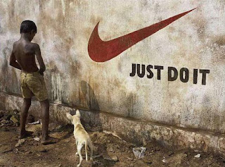
“’Just do it.’ ‘Where's the Beef?’ ‘Got Milk?’ …They are, in fact, the products of a multibillion dollar industry run by several huge multinational enterprises that design multilevel campaigns to get people to buy merchandise, services, ideas and elected officials, among other marketable products. The slogans are designed to educate humans to become bigger consumers. And they succeed. (http://documentaries.about.com/od/revie2/fr/ArtCopy.htm) Even though some people think it’s wrong, art and capitalism go hand in hand. Advertising is used to get people to buy the product, so the art in advertising does serve capitalism. The people in the advertising campaigns get paid well, which they should if the art they have created brought thousands of consumers to their client’s product. There is nothing wrong with making money for the art that you have created. Some people think that art is just for self expression or showing off someone’s talents. Why not sell your art and make money off of it? By selling the piece of art, it will be shown off to more people anyway.
“If you ever wondered how Nike came up with, ‘Just Do It,’ the slogan that the film tells us inspired women to divorce their husbands, the answer is simple: on the brink of his execution, a man on death row in Utah said, ‘Let's do it,’… a Nike man saw it and changed it to the catch phrase that helped Michael Jordan make Nike $5.2 billion. (http://sb.city2.org/blogs/paulrivas/blog_entries/626-review-of-art-copy-at-sbiff-art-serving-capitalism/blog_comments/new) All businesses use art to make money. How else would companies sell their product if they don’t advertise them? Some form of art is always needed for products to be advertised. Nike used the phrase ‘Just do it,’ which would be a form of art, and that helped them sell 5.2 billion dollars worth of product.
Thursday, September 9, 2010
Week 9 EOC: Triplets


These three ads are all from the Above the Influence ad campaign. They are "triplets" because they have the same layout, same style of images, and the compositions are the same.
The first ad has two insects sitting in the kitchen. One is pouring salt for the other insect and it already has salt on the table for itself. Salt is something that's bad for insects. The other insect is just looking while the salt is being poured. The second ad has two gophers sitting on the bed. One gopher is passing something to the other gopher, the other gopher just looks at it. Obviously its passing rat poison to the other gopher. The last one has two bees sitting in the living room. One bee passes bug spray to the other bee and it is just sitting there looking at it.
All three of these ads express the same idea. On the bottom right of the three ads say "What's the worse that could happen?" The gophers, bees, and insects represent people (teenagers more likely) and they are each passing something that would kill them to the other one. All three have almost the same color schemes: cool and gloomy. The only things are really saturated and have high contrast are the poison, salt, and bug spray- which represent drugs.
Analysis of Project in the Real World
I learned a lot of things by doing this ad campaign project. I learned the essentials of advertising a product and I was able to somewhat experience what ad agencies have to go through to be able to launch a successful ad campaign. "Within agencies, different theories arose about what constituted effective advertising" (Advertising by Design, Robin Landa pg. 4)
I learned some of the steps to launch an ad campaign from creating a slogan for the product, to analyzing the competetive brand, to promotion, and more. Creativity is also a big part of advertising. "Learning to think creatively is learning a way of thinking" (Advertising by Design, Robin Landa, pg 174) Before I did this final project, or even before I took this class, I didn't really pay attention to ads. Now, I look at advertisements in a different perspective. I notice how creative ads are when I watch ads on TV or look through a magazine. Recently, I find myself critiquing ads that I see because I've learned what elements an effective ad has. I know that effective ads establish an emotional connection with their viewers. "Just make them feel somehing. If you can emotionally move someone, then you just may have made an emotional connection with your client's brand or cause." (Advertising by Design, Robin Landa pg. 106)
I learned some of the steps to launch an ad campaign from creating a slogan for the product, to analyzing the competetive brand, to promotion, and more. Creativity is also a big part of advertising. "Learning to think creatively is learning a way of thinking" (Advertising by Design, Robin Landa, pg 174) Before I did this final project, or even before I took this class, I didn't really pay attention to ads. Now, I look at advertisements in a different perspective. I notice how creative ads are when I watch ads on TV or look through a magazine. Recently, I find myself critiquing ads that I see because I've learned what elements an effective ad has. I know that effective ads establish an emotional connection with their viewers. "Just make them feel somehing. If you can emotionally move someone, then you just may have made an emotional connection with your client's brand or cause." (Advertising by Design, Robin Landa pg. 106)
Creative Content

The creative content for my ad campaign is a magazine ad. On the left side, there is one black and white image on top of the other. "If 99 percent of TV ads are in color, then why not think of utilizing black-and-white or duotone film? They're ponging, so you ping. Take the least traveled path." (Advertising by Design, Robin Landa pg. 182) The top image is a nail salon that has a sign on the door that says "Sorry, out of business." The bottom image is a picture of what the inside of the nail salon looks like- deserted. On the right side of the ad are the words "You, don't need them anymore" goind downwards. On the bottom right is the product and the Sally Hansen logo.
The sign that says "sorry out of business" on the top left is the focal point of the ad. The viewers' eyes would then lead to the right to start reading the phrase "you don't need them anymore" which goes down to the product and logo. The viewers would then look at the rest of the ad on the left. "In an ad, the most important information is the message communicated by the combination of the line (headline) and visual... the designer should arrange all the elements within the composition to allow the viewer to move effortlessly from one element to another." (Advertising by Design, Robin Landa pg. 130)
The deserted nail salon image implies that Sally Hansen products is to blame. Because the Sally Hansen nail products work so great, nobody feels the need to go to nail salons anymore. "ads declare, proclaim (declare with force), announce (declare something for the first time), or state resolutely that a brand is scientifically proven , tested and retested..." (Advertising by Design, Robin Landa, pg. 93)
Promotion
To promote my product, my ad campaign will be doing a magazine ad "Your design is the visible representation of your ad idea or concept... designing an ad is key to successful communication. The design of an ad is the arrangement of the ad's parts into a composition that has graphic impact and communicates to a mass audience." (Advertising by Design, Robin Landa, pg. 65), but we will be doing nail art workshops as well. This will be a free workshop for everyone. All they have to do is buy at least one Sally Hansen nail polish and at least one Sally Hansen nail art pen from the workshop. There, consumers will learn the correct and most effective way to apply nail polish. They will also be learning how to use the nail art pens. There will be hundreds of nail art designs to choose from. Customers may choose however many designs they want to copy and practice applying it on their own finger nails.
The people that will be involved in the promotion are the people in my ad campaign, a few people from Sally Hansen, and consumers that want to do the workshop. "Here's the cardinal rule: Know your audience. Know what they'll tolerate. Know what they won't tolerate. Know what they find distasteful..." (Advertising by Design, Robin Landa pg. 142) My ad campaign will be there to analyze how effective the workshop is. The people from Sally Hansen will be there as the "trainers." They will be teaching the consumers how to apply the nail polish and show them the different ways one can use the nail art pens.
The first Sally Hansen Nail Art Workshop will happen one week after the magazine ads are launched so people will have an idea what the work shop is for. After the first workshop, it will be once a week for a whole month. After the month, workshops will be once a month for people who would like to learn how to use the nail polish and nail art pens effectively.
By doing the workshop, we can demonstrate how well the product works and consumers can see for themselves. "When a fragment of actual life experience, one with which we are completely familiar, is translated into a very short piece of drama or comedy, the result is slice-of-life advertising." (Advertising by Design, Robin Landa pg.96) Only in this case, they actually experience slice-of-life, not jst watch it. People will learn to love designing their own nails, which could even become a hobby. Therefore, more product will be sold.
The Big Idea
"The idea distinguishes a brand, endears it to the consumer, and motivates the consumer to run out and buy the brand or act on behalf of a social cause." (Advertising by Design, Robin Landa pg. 67) My big idea for my ad that will distinguish my product from others, is that Sally Hansen nail polish and nail art pens it work so great, that you would not need to go to the nail salon anymore. "Advertisers often choose to target groups of people" (Advertising by Design, Robin Landa pg. 37) My target audience will be women, young or grown, specifically ones who get their nails done. "Know your audience" (Advertising by Design, page 142) These women can use Sally Hansen no chip nail polish and use Sally Hansen nail art pens for creating designs for their finger nails. A lot of women go to nail shops for designs on their fingernails. With Sally Hansen nail art pens, women can save a thirty-five dollar trip to the nail salon and design their nails just the way they want it. "Ideas come from understanding how and why people use a product or service." ((Advertising by Design, Robin Landa pg. 42)
For my advertisement, there will be two images on top of each other. One image will show a nail salon that ran out of business. The other will show the inside of the nail salon that's completely deserted. "Overemphasizing a product's quality drives home a selling point quickly." (Advertising by Design, Robin Landa pg. 80) These images represent what nail salons would look like if women started using Sally Hansen nail products. It shows that women wouldn't need to go there anymore because they would rather do their names themselves with Sally Hansen nail polish and nail art pens. "...the exaggeration must be so extreme that we don't believe the actual events depicted in the ads, but we get the pont: this product is so good that..." (Advertising by Design, Robin Landa pg. 80)
For my advertisement, there will be two images on top of each other. One image will show a nail salon that ran out of business. The other will show the inside of the nail salon that's completely deserted. "Overemphasizing a product's quality drives home a selling point quickly." (Advertising by Design, Robin Landa pg. 80) These images represent what nail salons would look like if women started using Sally Hansen nail products. It shows that women wouldn't need to go there anymore because they would rather do their names themselves with Sally Hansen nail polish and nail art pens. "...the exaggeration must be so extreme that we don't believe the actual events depicted in the ads, but we get the pont: this product is so good that..." (Advertising by Design, Robin Landa pg. 80)
Sunday, September 5, 2010
Competitive Analysis

Sally Hansen's competitive brand is OPI Nail Lacquer. They are one of the first brands in the nail industry that started off selling to and through professional beauty or nail salons only. "From a contemporary perspective, one can easily see that there are many factors involved in why a consumer chooses one brand over another..." Advertising by design, Robin Landa pg. 4) Being known as a salon brand, OPI easily draw customers and clients. Customers tend to think that salon brand products are the better brands since they're used by industry professionals. They also have instructions for all the product they sell. Clever names are used for colors for each of their collection which draws attention.
OPI has foundations that donate to health-related charities and children's education. "One of the main strategies touted by the twentieth century ad pioneers was 'reason-why copy,' which essentially means that you provide a good, sensible argument." (Advertising by Design, Robert Landa pg.4) Some of their foundations are: Weiss-Fischmann, and Miriam Schaeffer, and the Schaeffer Family Foundation. They've also helped the American Red Cross after hurricane Katrina and fighting against diversion of professional beauty products. On top of that, OPI doesn't use animal testing.
Some of the complaints from consumers that have used OPI are: the high price even though the colors do chip, the colors are hard to get off your skin, has a strong odor, and some even say that the bottle shapes are a bit problematic. They also have issues of diversion, other companies “bootlegging” their products and copyright infringement.
OPI is very serious about diversion. They recently filed a lawsuit against TransDesign, a website that sold cosmetic prroducts, for illegally selling OPI nail products for a cheaper price than usual. They will file lawsuits for companies that they catch illegally selling their products.
Thursday, September 2, 2010
Sally Hansen: You don't need them anymore

A lot of women get their nails done at nail salons or spas. "Drawing upon life experience may be one of the richest techniques for finding ideas. There is nothing funnier or more interesting than the actual way people do what they do. Ideas can be based on the tiniest things we do: how we eat a sandwih dookie, how we tug at our underwear..." (Advertising by Design, Robin Landa pg. 72) Others do their nails themselves. A couple reasons women get their nails done somewhere by someone is for the convenience of having someone do it for them and the colors tend to last longer. "In advertising, when you draw upon common experiences- funny, sad, bittersweet- people usually relate. People should react: 'Yep, that's how it is!'" (Advertising by Design, Robin Landa pg.72) In my ad, I'm going to try to get the message across to my viewers that women don't need to go to the nail salon or have nail artists do their nails anymore to have long-lasting nail colors, they can just use Sally Hansen nail polish and Sally Hansen nail art pens for design. "Advertising differentiates brands and causes, ultimately sells brands, and calls people to action." (Advertising by Design, Robin Landa pg. 34)
EOC Week 8: Really Good Example of Chapter 8

“Using the product as the main visual usually puts the potential consumer on alert… if you see an ad where the most dominant visual element is a striking metaphor for something soft or strong, then you might be more likely to look at it.” (Advertising by Design, Robert Landa pg. 142)
Most ads have the product that their trying to sell as the dominant visual component. If advertisement is as simple as that, then why not just take a picture of the product and call it an ad? If the ad looks like other ads that people always see, then people probably wouldn’t take the time to stop and pay attention to it. In this Toyota ad, the main visual component is the geometric outline of a Toyota car, but not the car itself. Below the car, to the left, says “We see beyond cars.” The car is see-thru and you can see the view of a town beyond it. Instead of an actual car on the ad, they used that image to represent their employees building a great relationship with their customers and the community. Even though it looks like they’re not trying to sell their cars in this ad, they are trying to let people know about the good things that their company do for the community, which makes people like them a lot more so people buy their cars.
“If you have an unusual verbal message (one that is humorous, odd, curious, zany, or shocking), then the visual should be straightforward… If you have an unusual visual, then the verbal message (the line of copy) should be straight forward.” (Advertising by Design, Robert Landa pg. 159)
This quote clearly supports this Toyota ad. The visual is obviously unusual because they only show the geometric outline of the car, and not the car itself. The main verbal message in this ad is “We see beyond cars,” which is a pretty straight forward message. In the image, you can see what’s “beyond” the car, which is a town or a community. They support the verbal message by explaining with a short paragraph on the bottom of the page. Then, they put the logo on the top right corner. They used the color black so that it stands out with the light blue sky background.
Overall I think that this is a great ad. It delivers the message to people very well and it creates an emotional connection.
EOC Week 8: Authority
Reading tips given by agents from different advertising agencies is pretty helpful for my final project. Since I will be doing Sally Hansen (nail polish products) for my project, I will definitely be using some of the tips that the agents gave on the book. Carlos Segura from Segura Inc. in Chicago says, “Explore. A lot. Even after you think you’ve got it. Start again. You’d be surprised at what comes up. Even better, have several people look at the same problem. The solutions will astound you.” This tip is really helpful because many people would stop trying after they think they’ve got an idea or they know what they’re doing already. They become close minded after that. Another tip from Carlos is, “Seek opinions. This is hard, I know, but it does help.” Some people can accept constructive criticism well and some cannot. If you’re in the advertising industry, I think it is important to find out people’s opinions of your work so you know what you need to work on to do better in the future. Another agent, Deborah M. Rivera from Alexander & Richardson in New Jersey, exclaims “Do your font research!” It is important that one uses the appropriate font for the ads. So don’t favor one type of font, be open to using different ones and explore.
Thursday, August 26, 2010
EOC Week 7: Exciting Ad

VISUAL HIERARCHY: This is an advertisement for Woodland Shoes. When you first glance at this image ad, you look at the brown boot that's on top of the billboard, which is the focal point that you eyes will be first drawn to. Your eyes will then follow the shoe lace that's hanging from the boot down to the billboard. Since almost everything else is white, your eyes will then shift to the right where that green spot is. The green spot is the brands logo. This ad is effective because they used visual hierarchy so one will look at the whole ad.

POSITIVE/NEGATIVE SHAPES & SPACE: If you just quickly glance at this ad, it will make you look twice. This is an Ursus beer ad. There's a bottle int he middle that's upside down, and on each side there are two upside down bottles that are a little closer. The positive and negative spaces in this image creates an illusion of a backside and a male body part. The positive spaces are the body parts, while the negative space is used to create that illusion.

BALANCE: In this ad, you see six Dove girls. Three girls on the left are dark skinned and the three on the right are light skinned. This creates a feel of balance so that viewers can have a sense that the design is complete.

RHYTHM: In this anti-cigarettes ad, the smoke coming from the cigarette creates a circle around the woman's face. The circle of smoke creates rythm for this ad because it is repeating an element.
EOC Final Project: First Thought
For my final project, the company that I will be advertising for is Sally Hensen. Sally Hensen is a brand that sells beauty products from head to toe like facial creams, hair removers, tweezers, etc. My ad campaign will be promoting specifically their nail products, which they are most popular for. Nailene will be my competitive brand. For my images, I might do a few photos. This is just my first thought for the project, I might stick with this idea and I might change it.
EOC Week 6: Make 'Em Laugh
This is not just ONE of the funniest commercials I’ve seen, it is THE FUNNIEST commercial I have ever seen, yet! I literally teared up from laughing just by watching this commercial. It is a commercial that’s trying to sell Pro-Line, the most popular sports betting game in Canada’s Sports Select.
The commercial starts off with a guy mixing a jug of Gatorade. He tossed a towel and leaves the room quickly. Unaware, the towel that he tossed caused numbers of muscle relaxers to spill into a whole football team’s jug of Gatorade. Then, the commercial jumps to the football game. The whole football team that drunk that Gatorade are all drugged up and ‘high’ while playing professional football! It shows them laughing, laying on the ground, caressing the referee’s face, and other dumb stuff that people do when they’re drugged. One drugged up player catches the football. Not paying attention nor worried about the game at all, he caught the football and started tickling it like it was a baby, so he gets tackled. After he got tackled, the whole crowd was silent and probably in awe about what they have just seen in the field. Everyone was silent except for one guy who starts screaming from the top of his lungs. Then it shows his ticket that says “Pro-line” on it. Apparently he placed a bet against the drugged up team and he just won. The commercial ends with the line, “Because anything can happen, anyone can win.”
I think that this commercial is hilarious because of the fact that they accidentally drugged up the football team and showed how they act in the field. It was also really funny that only one guy was screaming after watching what happened and he was screaming because he won a bet against that team.
Thursday, August 19, 2010
EOC Week 6: Jerry Metellus

Today I had the pleasure of meeting Jerry Metellus, a successful fashion photographer. Very funny guy! There are many things that I learned from him today, but there are three things that I thought were very interesting:
First of all, let’s say you’re a photographer and you just sold somebody a shot that you did for fifty bucks. A few weeks later, you see that same picture that you took on billboards in the city, taxi cabs, magazines, etc. You see them all over the place and you’re proud and bragging about it. In reality, you just got totally ripped off because the person that you sold your picture to made thousands from it. I learned that you should really be careful about work: who you sell it to, what their using it for, etc. because that one picture can be worth thousands of dollars and you don’t even know it.
I also learned that photographers can’t work by themselves most of the time. You’re going to need help with things including hair and make-up artists, stylist, models, assistants, and technicians. The hair and make-up artists obviously make the models however the photographer wants them to look. Stylist puts together the outfits. Assistants help out the photographer and the technicians help with lighting, films, and more. All these people work together for the magic.
Last but not least, I learned that it is important to plan a professional photo shoot and not just go out and do it right away. Jerry said that there are many things you have to know before bidding and shooting. First, you need to know the location and setting (is it outdoors or indoors? Are you gonna have to bring lighting? Where is your vantage point going to be? Are you going to need a power generator?). You also need to know how many shots the client needs and how long are they giving you to do it. Photographers need to know these things before bidding so they can figure what the reasonable price is to charge their clients.
It was a great meeting Jerry Metellus and I hope that I will have the pleasure of working with him one day.
Thursday, August 12, 2010
EOC Week 5: Ad Categories

SLICE-OF-LIFE AD: When you look at this image, the main thing you see is a happy family having dinner together. This is a slice-of-life ad because it shows something that happpens in real life and it is something that people can relate to. It shows that having Stouffer's is a great way to get the family together and have a nice home-cooked dinner.

DECLARATION AD: This ad is a declaration because because it proclaims that not only will you hear the music when you're listening to your ipod, but you can also feel it. This implies that the sound an IPOD is better that all the other mp3 players.

IMAGE/LIFESTYLE AD: When people see ads like this, they want to be the girl or guy that's in the ad, or be like them. This ad sells make-up for Dolce & Gabbana, using Scarlette Johansson as their model. What girl wouldn't want to look like Scarlette? This is an image/lifestyle ad because they use their model so that people would buy their products because advertisers know they would want to look like her. The message that people get is that if they use this brand of make-up, they could look like Scarlette Johansson.
Thursday, August 5, 2010
EOC Week Four: Bob Isherwood. Why is he important?

“He won Australia's first Gold Lion for Cinema at the Cannes International Advertising Festival, and is one of the few people to have won the British Design and Art Direction Gold award for advertising, he has been elected to the Clio Hall of Fame in the US, and named Australia's leading creative director.” (http://www.conference.net.au/auiac2002/speakers/isherwood.htm)
“Australian born Bob Isherwood is the former Worldwide Creative Director of Saatchi & Saatchi. For 12 years, Bob took ultimate responsibility for the communications ideas the company created for some of the world’s major corporations including Procter & Gamble and Toyota. He was, for example, the Global Creative Director responsible for the launch and mass marketing of Toyota’s Prius.” (http://www.abeopartners.com/bob_isherwood/)
“The Australian-born advertising legend Isherwood leaves after 22 years at the agency. He joined Saatchi & Saatchi in 1986, to be made worldwide creative director a decade later in 1996… The decision to leave appears to have been some time in the making... ‘For the past 12 years I've been focused on the reinvention of Saatchi & Saatchi. Now I've reached a point where I feel I need to reinvent myself,’ he said. There is no news yet of who will replace Isherwood. Roberts has indicated that due to his close personal relationship with Isherwood…” (https://www.alumni.rmit.edu.au/NetCommunity/Page.aspx?pid=446)
Bob Isherwood had a very big impact in creative advertising. Just by looking at all his awards and achievements, there is no denying that he forever changed the standards of advertising. After working for Saatchi & Saatchi for twenty-two years, he just recently left because he wanted to ‘reinvent himself.’ His coworkers said that it will be really hard to replace him, no doubt about that. He left school when he was only thirteen-years old and became a mechanic (which he hated). Look at him now, he is one of the most influential people in the world.
BOC Week Four: Jerry Della Femina, the Big Idea

“On Sunday, January 28, 1969, the readers of the New York Times Magazine met ... ‘Lolling in a chair was the new creative supervisor of Ted Bates & Co. advertising agency, one Jerry Della Femina, 30 years old, a $50,000-a-year marvel out of Brooklyn, hired to bring a bit of sparkle to the Bates image’… It was Della Femina's first day on the job… Finally he cleared his throat. ‘I've got it! How about this for a headline: 'From Those Wonderful Folks Who Gave You Pearl Harbor.’” (http://www.designobserver.com/observatory/entry.html?entry=14668)
"By the time Della Femina published From Those Wonderful Folks, he was the hottest guy in the hottest business in town, running his own start-up agency and obviously loving it… Today we're invited to read Della Femina's memoir as a ‘key text for Mad Men,’… The most obvious connection between Della Femina's sixties and the sixties of Mad Men is the most titillating one: the uninhibited attitude towards sex and booze.” (http://www.designobserver.com/observatory/entry.html?entry=14668)
Jerry Della Femina shocked everyone on his first day on the job with his headline idea: From Those Wonderful Folks Who Gave You Pearl Harbor. He had to come up with an idea to promote Panasonic, a Japanese electronics company (note that World War II was only two decades past). People were shocked but were quite amused by his creative way of thinking. A year after, a book was published entitled From Those Wonderful Folks Who Gave You Pearl Harbor: Front Line Dispatches From the Advertising War. The book became the main source of inspiration for the show Mad Men, which is about the lives of men and women in Madison Avenue competing in advertising and beyond.
I think that Jerry Della Femina had a great impact in creative advertising. He did an amazing job incorporating humor in his work, not to mention his boldness(about sex and alcohol).
Thursday, July 29, 2010
EOC Week 3: Tobacco Advertisement
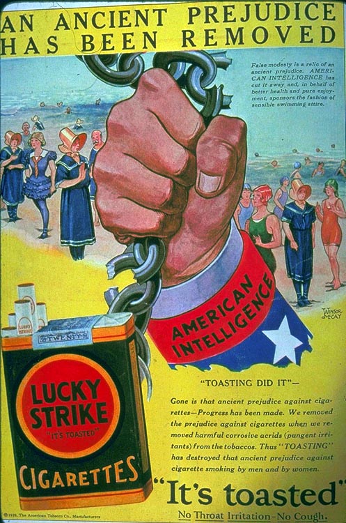
Interpret the problem- The problem is that people are ‘prejudice’ against cigarettes because they could eventually cause death. Another problem is that cigarettes contain harmful corrosive acids (pungent irritants that cause coughing and itching of the throat while smoking) in the tobacco, which obviously encourages people not to smoke.
Understand the creative brief- Since there was no way to prevent people from dying because of smoking cigarettes, they came up with an idea to take the corrosive acids out from the tobacco and say that it is safe to smoke cigarettes since there are no more corrosive acids, even though all it does is prevent the coughing and itching. They referred to the process of taking the irritants out as “toasting.”
Say it outright- The company that made this advertisement had a strategy of convincing people that the “American Intelligence” found a way to take the harmful corrosive acids out so that people could smoke without worrying about their health anymore.
Know your audience- Before this advertisement people thought were thinking that smoking is harmful for your health and that it has no advantages. The company that came up with this ad wants people to think that since they have taken out the harmful corrosive acids from the tobacco that is in cigarettes, then it will be safe to smoke cigarettes and people could enjoy smoking and relax.
Write your objective- Their objective is to encourage people to buy their cigarettes and for people to think that there is nothing wrong with smoking anymore because they have ‘toasted’ their tobacco.
Thursday, July 22, 2010
EOC Week 2: Ethics in Commercials
“Coca-Cola has been criticized for alleged adverse health effects, its aggressive marketing to children, exploitative labor practices, high levels of pesticides in its products, building plants in Nazi Germany which employed slave labor, environmental destruction, monopolistic business practices, and hiring paramilitary units to murder trade union leaders. In October 2009, in an effort to improve their image, Coca-Cola partnered with the American Academy of Family Physicians, providing a $500,000 grant to help promote healthy-lifestyle education; the partnership spawned sharp criticism of both Coca-Cola and the AAFP by physicians and nutritionists." (http://en.wikipedia.org/wiki/Coca-Cola#Criticism)
“Studies have shown that regular soft drink users have a lower intake of calcium, magnesium, ascorbic acid, riboflavin, and vitamin A… This was thought to be due to the presence of phosphoric acid, and the risk was found to be same for caffeinated and non-caffeinated colas, as well as the same for diet and sugared colas.” (http://en.wikipedia.org/wiki/Coca-Cola#Health_effects)
"We live in a world where we make choices every day and The Coke Side of Life encourages people to make those choices positive ones.“ (Marc Mathieu, The Coca-Cola Company) (http://www.youtube.com/watch?v=Z0Nwrfu1w5E)
In this Coca-Cola commercial, a bunch of human stick-figures are representing soldiers from the different countries involved in the World War II. Then the commercial shows the stick figures (with every country represented in a different color) having a war. After a little while the stick soldiers all stop fighting because they were all worn out, tired, and probably thirsty. A civilian stick figure walks by them drinking a coke, so they all started chasing him. The words “Life tastes better with Coca Cola” appear on the screen. This commercial is unethical because it implies that coke makes life better, but in reality, coke is not good for you and it could actually harm you.
BOC: About Me

I came from a city where very creative fashion designers reside. Manila, the capital city of the Philippines is where I was born and raised, also where I started my passion for fashion. I was about twelve when I saw a fashion show on T.V. and I just fell in love with the creative ways that people can dress. I still wasn’t sure what I wanted to do when I grew up, but whatever it was, it had to have something to do with fashion. Now I use my keen eye for fashion and use it in my everyday social and professional life. As a professional fashion merchandiser and stylist, I will utilize my passion and talent into the fashion industry by styling models for different kinds of photo shoots, working in fashion show productions, trade shows and retail stores, and becoming a buyer. Eventually I will run my own fashion company so I can incorporate my own brilliant designs into everything in my fashion line. I love everything about this industry because the number one rule in fashion is that there are no rules. Fashion is a great way to express my creativity and show off to the world what I do best. Like the fashionista saying goes, “Every day is a fashion show and the world is my runway.”
Thursday, July 15, 2010
EOC Week 1: VW Lemon

“The ad featured a black and white photo of the Volkswagen Beetle with the word “Lemon” in bold san serif font… that proclaims that this particular car was rejected… because of a blemish on the chrome piece of the glove box. The ad goes on to describe the rigorous inspection process...” (http://www.writingfordesigners.com/?p=1731)
“Ads before it were either information-based and lacking in persuasion, more fantasy than reality…Beetle ads, though, connected with consumers on an emotional level, while conveying a product benefit in a way consumers could relate to…” (http://www.bizjournals.com/sanjose/stories/1999/11/22/smallb7.html)
"The Volkswagen ad uses a black and white image of the Beetle that reinforced the idea that is was small and different... the ad says “LEMON” which caused the viewer to question his intuitive knowledge about Volkswagen’s high standards. The ad agency successfully caught the viewer’s attention by using self-effacing humor. With any luck, these ads drew you into the joke, and you would read the rest of the copy looking for the punch line.” (http://designhistorylab.com/?p=1755)
In the 1960s, Americans were used to driving big vehicles like Buicks and Cadillacs. So the Germans needed to find a way to advertise their cars and catch the American’s attention because their Volkswagen cars were smaller than what Americans were used to at the time. Although they were smaller, they are very efficient cars. Instead of the usual ad repetition, the DDB agency used their creativeness to capture the consumer’s attention. They made the Volkswagen ad very simple, but just the word “lemon” caught people’s attention. The word “lemon” proclaims that it is not a good car, this is what would cause people to be interested and read the rest of the advertisement. The rest of the ad describes the process of inspecting the Volkswagen cars which informs people that they really are good and efficient cars.
Subscribe to:
Posts (Atom)