By looking at the course objectives, I can see that I’m doing fairly well. Now that it’s the end of the quarter, I can answer most of the class objectives.
I was pretty nervous about taking this class in the beginning of the quarter, because I had no knowledge, whatsoever, about the advertising industry. All I knew was what some ads are funny, and some were not. Now, I can look at an ad, and evaluate it like I was an industry professional. Since we had to do an ad campaign for the final project, I am able to define advertising from the perspective of the industry. I had to step in their shoes and somewhat experience how it’s like to run an ad campaign. I have learned the steps for a successful ad campaign and I learned what different types of ads there are. I’ve also learned what elements an effective advertisement should have. The key thing I learned about advertising is that if the ad cannot establish even a little emotional connection with the viewer, then the ad is unsuccessful. I can look at an ad and I can tell if the ad agency that did it did a good job or not.
In honesty, I’m able to answer most of the objectives except a couple of them. If I were to test myself, I couldn’t answer “Identify and explain federal regulations, which affect the advertising industry,” and also “Review major trade journals and advertising industry organizations.” I’m not sure if our class covered this material, but if we did, then I guess I didn’t quite understand it.
In all honesty again, I think that the instructor is great. He has a lot of knowledge, not just about advertising, but a lot of random, interesting things as well. He is really good with teaching his students in an effective way. He kept me interested throughout the course which is probably why I learned so much.
Even though I didn’t learn some of the objectives, all-in-all I still learned a whole lot in this class. I started off without any knowledge about the advertising industry, and now I can evaluate ads in a industry professional manner. The grade that I believe I deserve is an ‘A.’
Thursday, September 23, 2010
Thursday, September 16, 2010
EOC Week 10: Art Serving Capitalism
“’Just do it.’ ‘Where's the Beef?’ ‘Got Milk?’ …They are, in fact, the products of a multibillion dollar industry run by several huge multinational enterprises that design multilevel campaigns to get people to buy merchandise, services, ideas and elected officials, among other marketable products. The slogans are designed to educate humans to become bigger consumers. And they succeed. (http://documentaries.about.com/od/revie2/fr/ArtCopy.htm) Even though some people think it’s wrong, art and capitalism go hand in hand. Advertising is used to get people to buy the product, so the art in advertising does serve capitalism. The people in the advertising campaigns get paid well, which they should if the art they have created brought thousands of consumers to their client’s product. There is nothing wrong with making money for the art that you have created. Some people think that art is just for self expression or showing off someone’s talents. Why not sell your art and make money off of it? By selling the piece of art, it will be shown off to more people anyway.
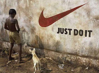
“If you ever wondered how Nike came up with, ‘Just Do It,’ the slogan that the film tells us inspired women to divorce their husbands, the answer is simple: on the brink of his execution, a man on death row in Utah said, ‘Let's do it,’… a Nike man saw it and changed it to the catch phrase that helped Michael Jordan make Nike $5.2 billion. (http://sb.city2.org/blogs/paulrivas/blog_entries/626-review-of-art-copy-at-sbiff-art-serving-capitalism/blog_comments/new) All businesses use art to make money. How else would companies sell their product if they don’t advertise them? Some form of art is always needed for products to be advertised. Nike used the phrase ‘Just do it,’ which would be a form of art, and that helped them sell 5.2 billion dollars worth of product.
Thursday, September 9, 2010
Week 9 EOC: Triplets


These three ads are all from the Above the Influence ad campaign. They are "triplets" because they have the same layout, same style of images, and the compositions are the same.
The first ad has two insects sitting in the kitchen. One is pouring salt for the other insect and it already has salt on the table for itself. Salt is something that's bad for insects. The other insect is just looking while the salt is being poured. The second ad has two gophers sitting on the bed. One gopher is passing something to the other gopher, the other gopher just looks at it. Obviously its passing rat poison to the other gopher. The last one has two bees sitting in the living room. One bee passes bug spray to the other bee and it is just sitting there looking at it.
All three of these ads express the same idea. On the bottom right of the three ads say "What's the worse that could happen?" The gophers, bees, and insects represent people (teenagers more likely) and they are each passing something that would kill them to the other one. All three have almost the same color schemes: cool and gloomy. The only things are really saturated and have high contrast are the poison, salt, and bug spray- which represent drugs.
Analysis of Project in the Real World
I learned a lot of things by doing this ad campaign project. I learned the essentials of advertising a product and I was able to somewhat experience what ad agencies have to go through to be able to launch a successful ad campaign. "Within agencies, different theories arose about what constituted effective advertising" (Advertising by Design, Robin Landa pg. 4)
I learned some of the steps to launch an ad campaign from creating a slogan for the product, to analyzing the competetive brand, to promotion, and more. Creativity is also a big part of advertising. "Learning to think creatively is learning a way of thinking" (Advertising by Design, Robin Landa, pg 174) Before I did this final project, or even before I took this class, I didn't really pay attention to ads. Now, I look at advertisements in a different perspective. I notice how creative ads are when I watch ads on TV or look through a magazine. Recently, I find myself critiquing ads that I see because I've learned what elements an effective ad has. I know that effective ads establish an emotional connection with their viewers. "Just make them feel somehing. If you can emotionally move someone, then you just may have made an emotional connection with your client's brand or cause." (Advertising by Design, Robin Landa pg. 106)
I learned some of the steps to launch an ad campaign from creating a slogan for the product, to analyzing the competetive brand, to promotion, and more. Creativity is also a big part of advertising. "Learning to think creatively is learning a way of thinking" (Advertising by Design, Robin Landa, pg 174) Before I did this final project, or even before I took this class, I didn't really pay attention to ads. Now, I look at advertisements in a different perspective. I notice how creative ads are when I watch ads on TV or look through a magazine. Recently, I find myself critiquing ads that I see because I've learned what elements an effective ad has. I know that effective ads establish an emotional connection with their viewers. "Just make them feel somehing. If you can emotionally move someone, then you just may have made an emotional connection with your client's brand or cause." (Advertising by Design, Robin Landa pg. 106)
Creative Content

The creative content for my ad campaign is a magazine ad. On the left side, there is one black and white image on top of the other. "If 99 percent of TV ads are in color, then why not think of utilizing black-and-white or duotone film? They're ponging, so you ping. Take the least traveled path." (Advertising by Design, Robin Landa pg. 182) The top image is a nail salon that has a sign on the door that says "Sorry, out of business." The bottom image is a picture of what the inside of the nail salon looks like- deserted. On the right side of the ad are the words "You, don't need them anymore" goind downwards. On the bottom right is the product and the Sally Hansen logo.
The sign that says "sorry out of business" on the top left is the focal point of the ad. The viewers' eyes would then lead to the right to start reading the phrase "you don't need them anymore" which goes down to the product and logo. The viewers would then look at the rest of the ad on the left. "In an ad, the most important information is the message communicated by the combination of the line (headline) and visual... the designer should arrange all the elements within the composition to allow the viewer to move effortlessly from one element to another." (Advertising by Design, Robin Landa pg. 130)
The deserted nail salon image implies that Sally Hansen products is to blame. Because the Sally Hansen nail products work so great, nobody feels the need to go to nail salons anymore. "ads declare, proclaim (declare with force), announce (declare something for the first time), or state resolutely that a brand is scientifically proven , tested and retested..." (Advertising by Design, Robin Landa, pg. 93)
Promotion
To promote my product, my ad campaign will be doing a magazine ad "Your design is the visible representation of your ad idea or concept... designing an ad is key to successful communication. The design of an ad is the arrangement of the ad's parts into a composition that has graphic impact and communicates to a mass audience." (Advertising by Design, Robin Landa, pg. 65), but we will be doing nail art workshops as well. This will be a free workshop for everyone. All they have to do is buy at least one Sally Hansen nail polish and at least one Sally Hansen nail art pen from the workshop. There, consumers will learn the correct and most effective way to apply nail polish. They will also be learning how to use the nail art pens. There will be hundreds of nail art designs to choose from. Customers may choose however many designs they want to copy and practice applying it on their own finger nails.
The people that will be involved in the promotion are the people in my ad campaign, a few people from Sally Hansen, and consumers that want to do the workshop. "Here's the cardinal rule: Know your audience. Know what they'll tolerate. Know what they won't tolerate. Know what they find distasteful..." (Advertising by Design, Robin Landa pg. 142) My ad campaign will be there to analyze how effective the workshop is. The people from Sally Hansen will be there as the "trainers." They will be teaching the consumers how to apply the nail polish and show them the different ways one can use the nail art pens.
The first Sally Hansen Nail Art Workshop will happen one week after the magazine ads are launched so people will have an idea what the work shop is for. After the first workshop, it will be once a week for a whole month. After the month, workshops will be once a month for people who would like to learn how to use the nail polish and nail art pens effectively.
By doing the workshop, we can demonstrate how well the product works and consumers can see for themselves. "When a fragment of actual life experience, one with which we are completely familiar, is translated into a very short piece of drama or comedy, the result is slice-of-life advertising." (Advertising by Design, Robin Landa pg.96) Only in this case, they actually experience slice-of-life, not jst watch it. People will learn to love designing their own nails, which could even become a hobby. Therefore, more product will be sold.
The Big Idea
"The idea distinguishes a brand, endears it to the consumer, and motivates the consumer to run out and buy the brand or act on behalf of a social cause." (Advertising by Design, Robin Landa pg. 67) My big idea for my ad that will distinguish my product from others, is that Sally Hansen nail polish and nail art pens it work so great, that you would not need to go to the nail salon anymore. "Advertisers often choose to target groups of people" (Advertising by Design, Robin Landa pg. 37) My target audience will be women, young or grown, specifically ones who get their nails done. "Know your audience" (Advertising by Design, page 142) These women can use Sally Hansen no chip nail polish and use Sally Hansen nail art pens for creating designs for their finger nails. A lot of women go to nail shops for designs on their fingernails. With Sally Hansen nail art pens, women can save a thirty-five dollar trip to the nail salon and design their nails just the way they want it. "Ideas come from understanding how and why people use a product or service." ((Advertising by Design, Robin Landa pg. 42)
For my advertisement, there will be two images on top of each other. One image will show a nail salon that ran out of business. The other will show the inside of the nail salon that's completely deserted. "Overemphasizing a product's quality drives home a selling point quickly." (Advertising by Design, Robin Landa pg. 80) These images represent what nail salons would look like if women started using Sally Hansen nail products. It shows that women wouldn't need to go there anymore because they would rather do their names themselves with Sally Hansen nail polish and nail art pens. "...the exaggeration must be so extreme that we don't believe the actual events depicted in the ads, but we get the pont: this product is so good that..." (Advertising by Design, Robin Landa pg. 80)
For my advertisement, there will be two images on top of each other. One image will show a nail salon that ran out of business. The other will show the inside of the nail salon that's completely deserted. "Overemphasizing a product's quality drives home a selling point quickly." (Advertising by Design, Robin Landa pg. 80) These images represent what nail salons would look like if women started using Sally Hansen nail products. It shows that women wouldn't need to go there anymore because they would rather do their names themselves with Sally Hansen nail polish and nail art pens. "...the exaggeration must be so extreme that we don't believe the actual events depicted in the ads, but we get the pont: this product is so good that..." (Advertising by Design, Robin Landa pg. 80)
Subscribe to:
Posts (Atom)